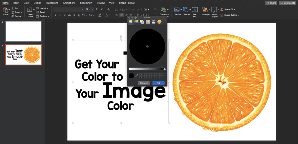
 Have you ever wondered how to get your text color to match your image color? It’s not hard and can make a good slide become an amazing slide. Matching colors make consistent, professional-looking PowerPoint or Keynote slides. The steps to make this happen are very simple and in this post, I will hopefully show you how it’s done. This feature is available from PowerPoint 2013 on, but not on older versions (This can also be done on keynote).
Step 1: Pick an Image
The first step is to pick an image you like and a color you would like to emphasize on your slide. In this example I have chosen an orange slice. The text is all in black, but I would like to emphasize the words “text” and “image”.

Step 2: Click on Text Color
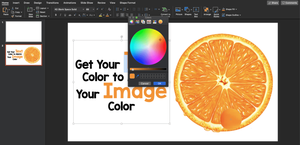
Select the text color drop-down menu. At the bottom of the dropdown menu you get the option to choose more colors. Click on this. Now at the bottom of your drop-down menu you will see an eyedropper icon. If you click on this, it will give you a bigger circle that you can move over your image to select the color you want for your text. Once you get the color you want click on your desired color.


You will now see your color next to the dropper. Now, highlight the text you want to change colors for and pick the color you chose. Now your slide will look like the following.

Post Peer Reviewed By: Anand Swaminathan, MD (Twitter: @EMSwami)
The post Slide Design Tip: How Does an Eyedropper Improve Slides? appeared first on REBEL EM - Emergency Medicine Blog.
