 Recently, I just finished reading a book called Presentation Zen by Garr Reynolds. This book is a game changer in the presentation world in my humble opinion. If you are giving presentations at any level, this is a must read book. Now I know that REBEL EM has traditionally been a clinical blog, but every once in a while we come across something that is just too good to not share. What I am going to try and do in this blog post is summarize some of the key messages of this book. In the book the author basically breaks presentations down into 3 parts and applies principles from the art of Zen:
- Restraint in Preparation
- Simplicity in Design
- Naturalness in Delivery
The Preparation
- First Go Analog: Don’t prepare your talk at a computer, instead get off the grid and go old school. You can use whiteboards, post its, or even paper and pencil for this process. This approach allows you to sketch out ideas and really solidify and simply your message.
- Brainstorming: This is just a free flow of ideas pouring out onto paper. Don’t worry about editing, you may be surprised what ideas you actually come up with
- Identify What Your Core Message Is: In other words, if you gave a lecture and wanted people to remember one thing, what do you want that to be?
- Grouping: From your free flow of ideas find 2 – 4 key ideas that will support your core message
- Storyboarding: Now take the ideas you have decided that support your core message and start putting it in order. Feel free to arrange and re-arrange content until you feel that the presentation structure and flow feel right.

- After all this now open up your computer and start putting your presentation together
The Design
- Signal to Noise Ratio: The signal is your message and everything else is the clutter. Get rid of anything that doesn’t get your message across. You want to have the highest signal-to-noise ratio on your slides (Amplification through simplification).


- Don’t Use the 1-7-7 Rule: One main point per slide, seven lines of text maximum, and seven words per line maximum. This is still death by bullet point. Your audience will tire quickly with slide after slide of bulleted lists.
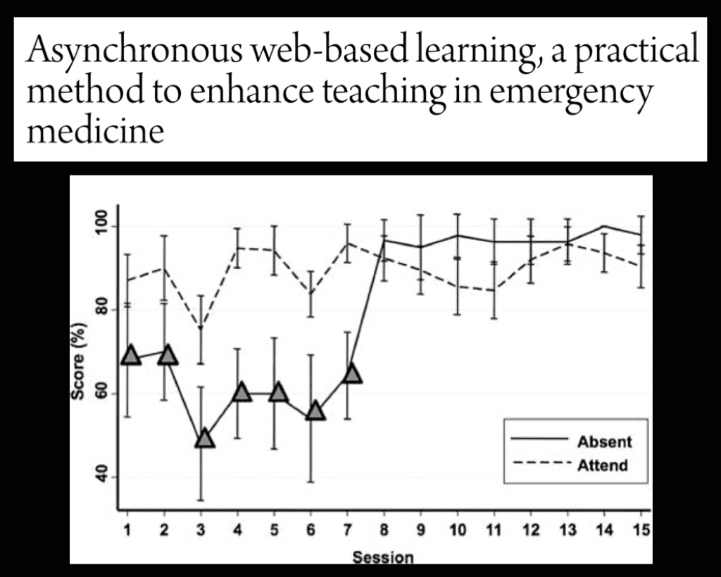
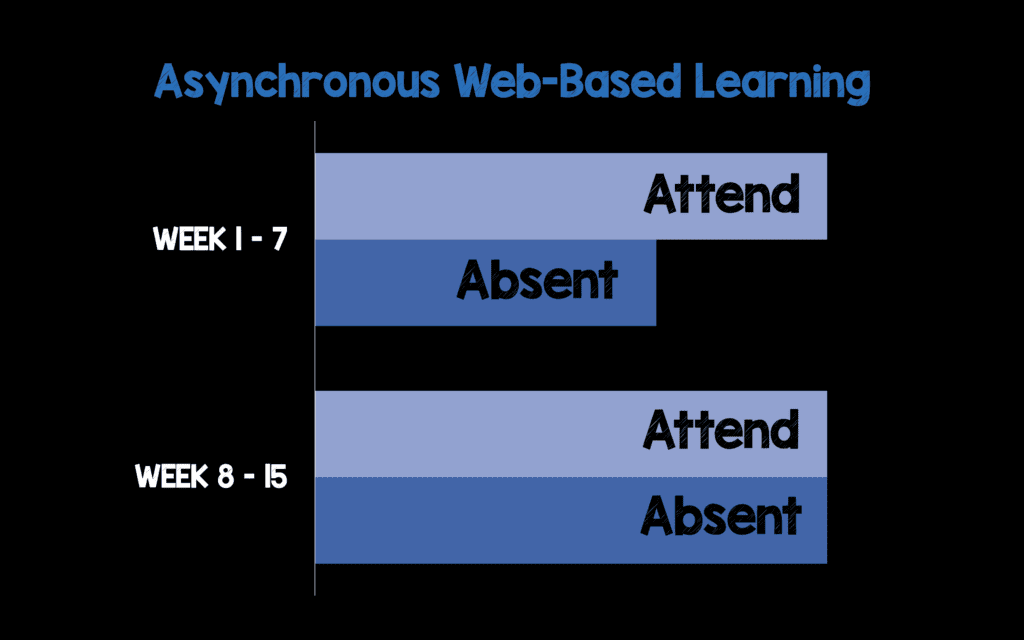
- Redo Graphs/Charts: Instead of taking a snapshot of a bunch of data, redo the pertinent data in a more aesthetically pleasing way. Don’t use 3D graphs and charts for 2D data.


- Picture Superiority Effect: Simply put…a picture is worth 1000 words. It is more difficult to process information when it is delivered both verbally and in written form at the same time. We naturally remember pictures better than words. So try and use pictures instead of words on your slides. Avoid the Slideument (Slide + Document)!!! Remember, slides should reinforce your words, not repeat them.


-
Recommended Sites for Good Images:
- iStockphoto: Not FREE. Either $12/image or 1 month Subscription $166.58/month with 750 images/month allowed to download
- Free Sites: Morgue File, Flickr Creative Commons Pool, Stock.xchng, Everystockphoto Search Engine, Pixabay
- Empty Space: Empty space on a slide can really emphasize the visual elements of a slide very powerfully. The more stuff added on the slide, the more diluted and less effective the message of our graphic becomes.


- Contrast: Simply means difference. Slides with strong contrast attract interest, and help audiences make sense of the point of the design. Contrast can be achieved by manipulation of space, color choices, size of objects, text selection, object positioning.
- Repetition: Have certain elements repeat them selves to show a theme to the talk. This is more concerned with elements across a deck of slides.
- Alignment: Nothing should be random on a slide. This is more concerned with elements on a single slide.
- Proximity: Things that are related should be closer and things that aren’t should be farther apart
The Delivery
- Rehearse, Rehearse, Rehearse: This is a nice way to be more natural when you actually give your presentation
- Tell a Story: This will make a connection with the audience. Stories are easier to remember than lists of rules.
- Leave Your Audience Hungry for More: Leave time for questions. No one ever complained because your 1 hour talk finished 15 minutes early
- Leave the Lights On: In order to make a connection with the audience they need to be able to see you.
- Don’t Use Podiums: This gives you a more authoritative appearance and less engaging
- Use a Lavalier Microphone: Give yourself the freedom to move around the stage
- Have a Small Remote Control: This way you can advance your slides without having to keep going back or being stuck at the computer. A small and basic remote is all you really need: the ability to advance, go back, and turn your screen black.
- Handouts can Set you Free: Creating a document with all the little facts of your talk that you can leave behind will help you not feel so compelled to put everything into your slides. After all if your slides can stand by themselves, why are you even up on stage?
The Bottom Line: Exercise restraint in preparation, simplicity in design, and naturalness in your delivery.
For More on Giving a Great Talk Checkout:
- Nancy Duarte: The Secret Structure of Great Talks
- Garr Reynolds: Why Storytelling Matters
- TED Talks
- Presentation Zen
- P3 Presentations
- Duarte
Post Peer Reviewed By: Rob Rogers (Twitter: @EM_Educator)
The post Presentation Zen appeared first on REBEL EM - Emergency Medicine Blog.
