
It is impossible for the audience to read and listen at the same time. A person can task switch, but cannot multitask, therefore if they are reading your slides, they are not listening to you. Vision is one of our most important senses. It is a well-known fact that the a significant portion of our brain is wired for vision, therefore, try to find a single image that encompasses the main message of your slide, then use your actual voice to fill in the blanks. It takes our brains longer to process text-based information than it does visual information.
The 1-7-7 Rule (aka. Slide + Word Document = The Slideument)
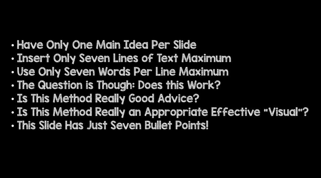
I can’t still believe the 1-7-7 rule is a thing. Basically, this idea states that each slide can have one main idea, 7 lines of text, with 7 words per line. This is no better than a word document crammed into a slide (i.e. the slideument). Below is an example of what this would look like.

Multiple Pictures in One Slide
Is there a rule somewhere that states we have to put everything on one slide? Often, I see people putting multiple images on one slide. You may be able to see this on your computer, but imagine being in the back row of the audience. These images will be too small to be discernible. Simply find the core message of your slide and clearly deliver a single message. Instead of multiple images and multiple messages per slide, use just one image per slide and break the idea down into multiple slides. This will be much easier for the audience to comprehend and digest.

Hi-Resolution Images
Use only high-resolution images. There is nothing worse than having to look at fuzzy images while a presenter speaks. At first glance, it may seem difficult to find high-resolution images that are free, but here’s a list of sites (in my descending order of preference) that offer just that:

BOTTOM LINE: If you learn nothing else from this post, remember this tip: DO NOT use bulletpoints followed by lines of text in your presentation. Pictures can be very impactful way of reducing text on your slides and indeed “worth a thousand words.”

Post Peer Reviewed By: Anand Swaminathan (Twitter: @EMSwami)
The post Don’t Kill Your Audience with Bulletpoints appeared first on REBEL EM - Emergency Medicine Blog.
